Locum Plus
A brand identity and product concept for a locum medical-staffing platform - built on one promise: a better way to find locum work.
- Client
- Sector
- Services
- Year
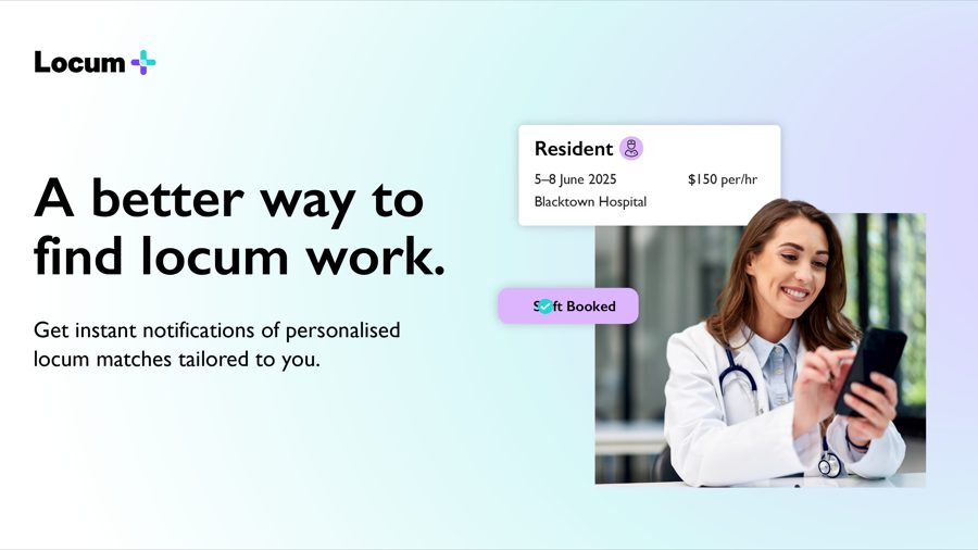
A better way to find locum work.



Your next shift, booked in one tap.


A wordmark anchored by a plus - the gradient mark runs violet to teal, the two ends of a shift met in one symbol.

The plus lifted out on its own - one confident symbol that reads at any size.

A cool spectrum from violet through cyan to teal, warmed by a single coral, with soft tints for backgrounds.

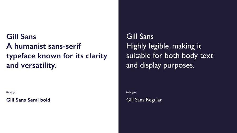
Gill Sans - a humanist sans with the clarity a clinical product needs. Semibold for headings, regular for text.

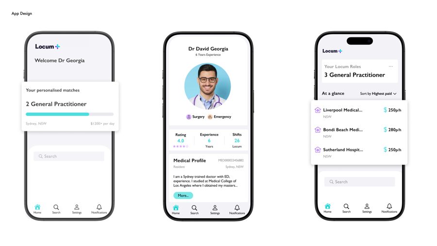
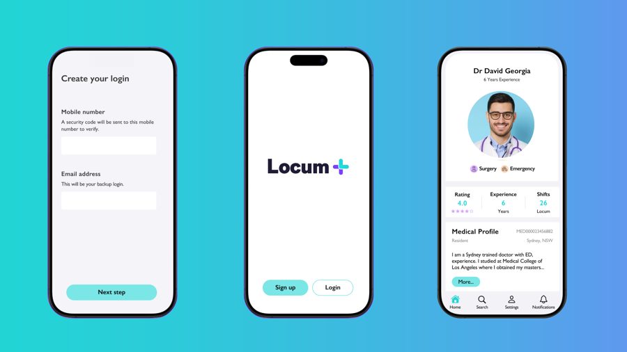
The app the brand is built for - personalised matches, medical profiles and one-tap shift booking.

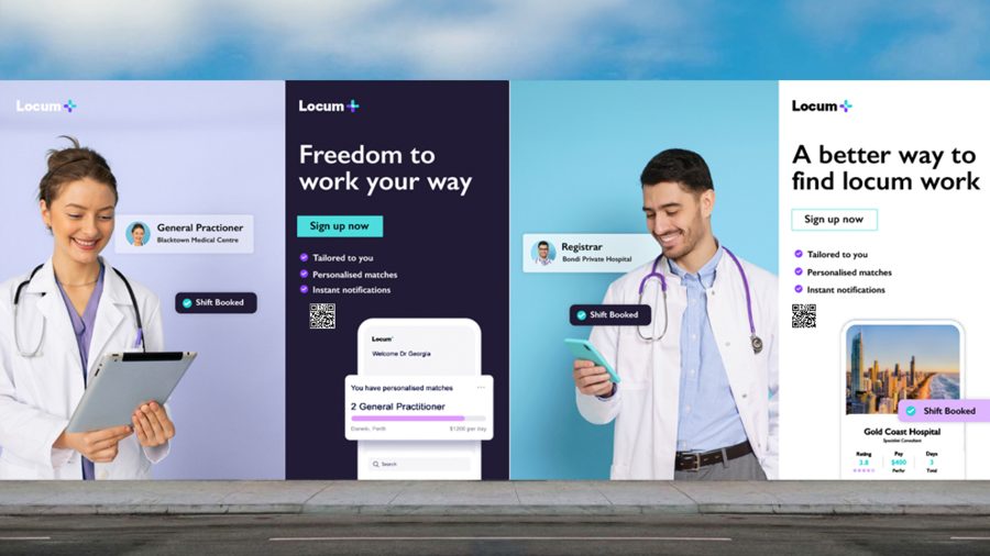
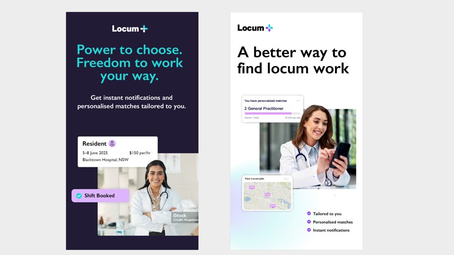
Real clinicians on branded backgrounds, lit soft and confident - the brand's people, framed by its colour.

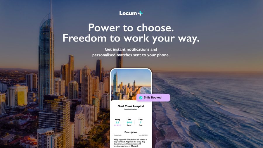
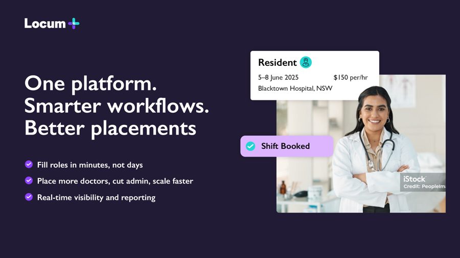
One platform. Smarter workflows. Better placements - the homepage that turns the promise into product.

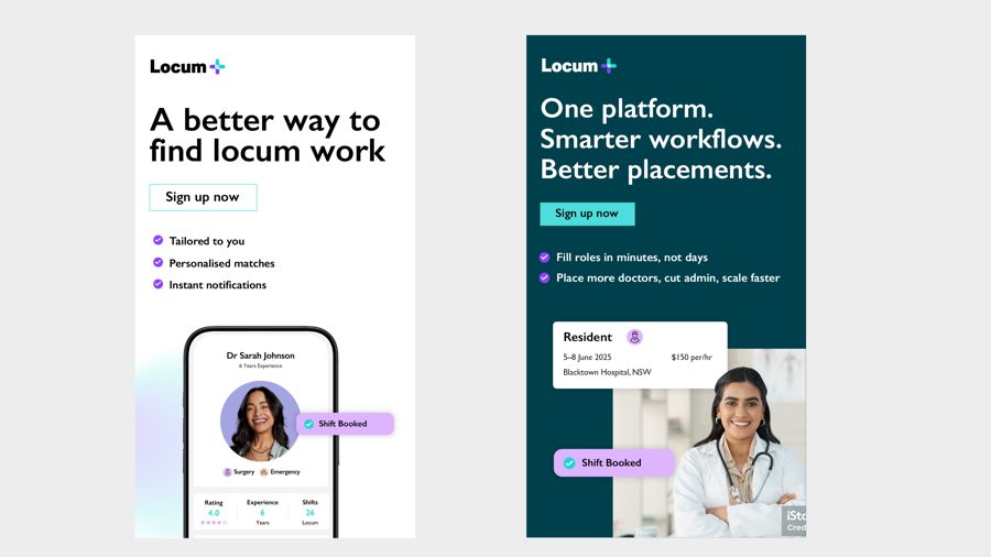
Power to choose, freedom to work your way - advertising that speaks straight to the clinician.

